GPARENCY LLC

Scaling design and development with a design system

PLATFORM:
Figma
TIMELINE:
Q2 2022 - Q1 2023
ROLE:
Product Designer
TEAM:
Designer,
Head of Design

Our Products Were Visually Inconsistent

Inconsistent designs creates a negative user experience

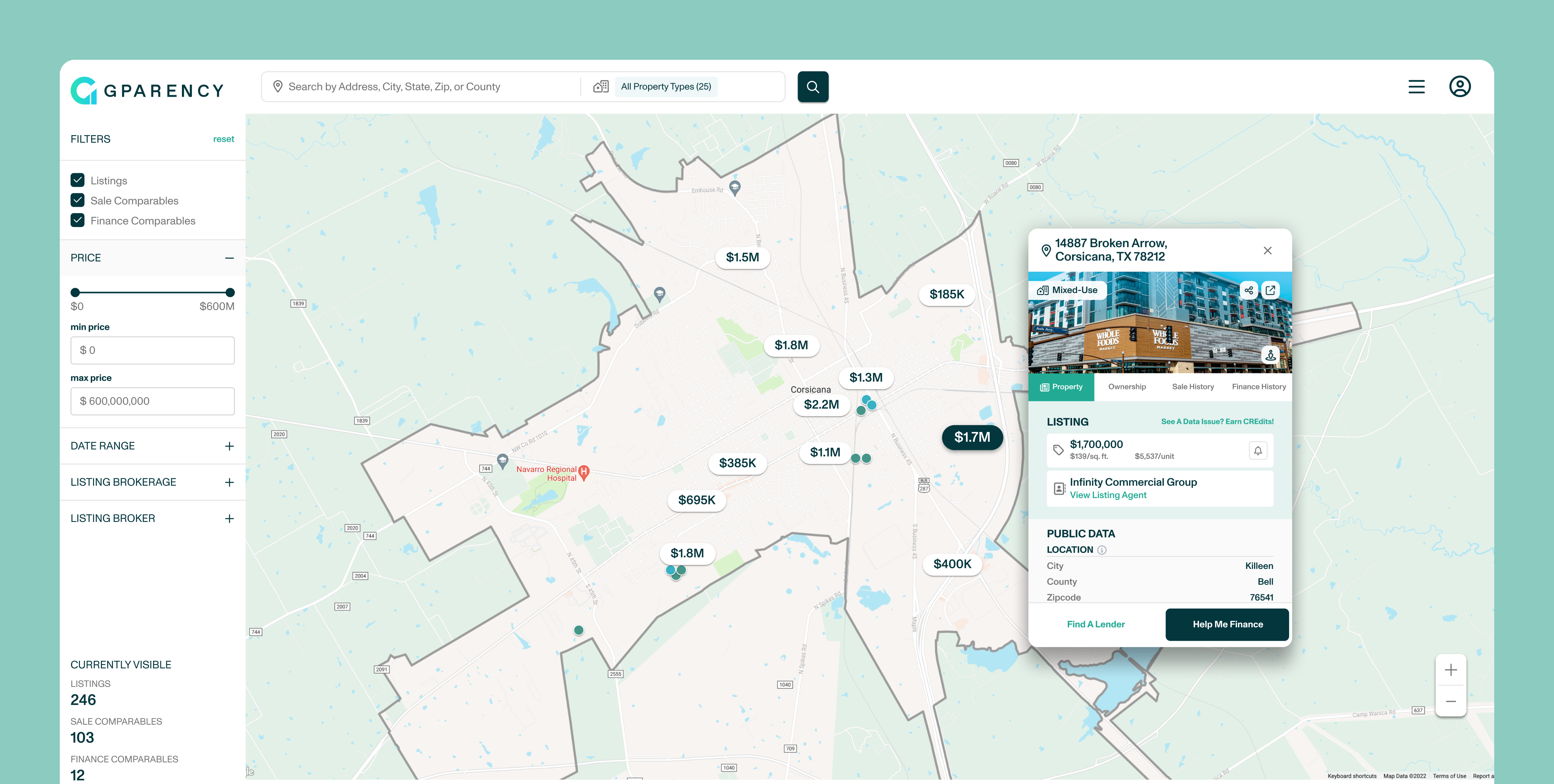
GPARENCY used two contractors to design our products that implemented their own styling. Our products suffered from design inconsistencies and contributed to a confusing user experience.

We wanted to create a design system to establish visual cohesion across all products and improve development speed but we ran into many problems when ideating how to move forward with our design system.

Design audit revealed major design issues

When performing an audit of our products and current designs we found these issues:

  • Inconsistencies in how we used certain components where different colors and sizes used
  • Many of our colors did not pass WCAG 2.1
  • Inconsistent experiences due to no clear rules on how to use components

Creating The Foundation

The fundamentals of our design system

I worked with my manager, the Head of Design to ideate what we needed to include in the design system and scoped out new components we needed to build.

We implemented these processes to guide us through the creation of our design system:

  • Create a single source of truth in Figma to maintain components and design guidelines built by the design team
  • Documentation for the product team (product, design, & developers) on how to use the design system and set them up for success
  • Install new processes to change or build new components through an internal review system

Utilizing Variants & Interactive States

Fostering a strong designer & developer relationship

We wanted to create a shared language between designers and developers as we would be in constant collaboration together. Our components had similar naming conventions as developers, reducing the time they needed to reference and code them.

Built-in prototyping to quickly provide answers

Our components had built-in prototyping interactions created to mimic a live prototype. This helped us do two major things:

  • Share our vision of how a new feature should work using a high-fidelity prototype
  • Solves the question of "what happens if I hover or click this button" during testing
Figma vs Live Build

Design specs matched the dev build on our modal forms

Prototype of variant being used

Utilizing variants to show different states and levels of customization

Establishing A Design Language

Keep it organized and searchable

We labeled our Input Fields by use case and state so that we kept our file organized and searchable. This contributed to our design language by using the correct combination when handed over to developers.

Make it simple to create sustainable and scalable designs

When we needed to make changes, it would only affect the necessary parts as we only had to update them with the new values. We applied this method throughout our file to create sustainable and scalable designs.

Organization and layout of input fields on file

Input Fields organized by use case and states so that they can be referenced quickly

Maintaining Clear UX Documentation

Keep track of the past in order to inform the future

To set our team up for success, we wanted to create documentation for both new and existing team members.

We wrote guides on how to contribute to our design system and when to use certain components. We also logged all our changes to keep track of when and what we added or changed to the design system.

Design notes and Change Log

Results & Expected Outcomes

The creation of our design system helped reduce our design debt by increasing our design velocity. We were able to prioritize new features coming from the product roadmap and have designs ready for devs to build when a new sprint rolled around.

Our dev team loved the design system as they could reference the design specs of our component by using the design system as a single source of truth.

Here are some of our accomplishments and expected outcomes:

  • Reduced product backlog to meet user needs and business goals
  • Decreased UI errors by establishing consistent components during design to dev handoff
  • Updating legacy designs to utilize design system guidelines and create visual cohesion across all products
  • Paving the way for designs to be scalable and sustainable in the long run for future teams
  • Stronger design & dev relationships by creating opportunities to build design tokens to maximize efficiency

fin.

Scroll To Top